How to Measure Demand for a SaaS Idea (Before You Build It)
Concrete methods to measure demand for a SaaS idea: search and complaint volume, recency trend, breadth, smoke tests, and willingness-to-pay probes, grounded in live developer signal data.
 Alessio Persico Founder of EchoSift



On EchoSift’s signal feed, demand for any given developer problem spreads across a range that covers two orders of magnitude: “Improving README Documentation and Structure” carries a volume of 218 mentions, while “GitHub API Rate Limit Indicator” sits at just 16, yet both technically answer “do people want this?” with a yes. The question that actually helps is “how much do people want this, and how do I know?”, because demand is a quantity, and like any quantity it can be estimated with instruments before you commit a single sprint to building. Founders who skip that measurement step ship on a hunch and then reverse-engineer a story about why the empty dashboard is temporary.
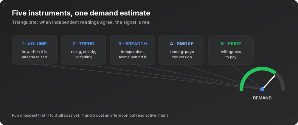
This piece is a toolkit. It walks through five separate instruments for putting a number on demand, what each one actually measures, and where each one lies to you. The goal is not one magic metric. It is triangulation: several independent readings that either agree, in which case you have real signal, or disagree, in which case you have found the exact assumption to test next.
How this differs from our market-research tips. This guide is the measurement layer: the five instruments and where each one deceives you. It is not the decision playbook around them. For the research discipline, kill criteria you commit to in writing before you look, an interview cadence you can actually keep, and validating the wedge apart from the vision, see tips for market research. Measure here; decide there.
The figures used as worked examples below are live aggregates from EchoSift’s signal feed, which continuously reads developer complaints and questions across GitHub, Stack Overflow, Hacker News, and Bluesky (4 sources) and groups them into recurring patterns. Nothing here is invented to make a point. Here is the state of the feed on the snapshot date.
Demand is a quantity you can estimate early
The reason demand feels unmeasurable is that people confuse it with revenue, and revenue only exists after you build. But demand leaves fingerprints long before money changes hands. Every time someone searches for a workaround, files an issue, asks a question, or joins a waitlist, they leave a trace of intent. Measuring demand is the discipline of collecting those traces and converting them into a rough magnitude you can compare across ideas.
Developer tools have an unfair advantage here. Your prospective users document their problems in public, in writing, timestamped, and attributed to a project. That means you can read the demand for a category before you write a line of code, which is a luxury a new restaurant or a consumer app rarely gets. The instruments below range from the fully passive (read what already exists) to the mildly active (put up a page and count who bites). Run them in that order, cheapest first.
Instrument 1: existing volume of the problem
The first reading is the crudest and the cheapest: how often is this problem already being raised? Keyword search volume answers it for solution-aware demand, the people already typing your category into a search box. Public complaint volume answers it for problem-aware demand, the people hurting who have not yet gone looking for a tool. Both are counts, and a count is where every demand estimate begins.
In our feed, raw volume spreads across an enormous range.
That spread is the point. A four-figure keyword and a two-figure keyword are not the same market, and knowing which end of the range your idea lives in is the first fact worth having. But volume alone is a trap, because a big number can be old, stale, or generated by a tiny crowd repeating itself. The next three instruments exist to correct exactly those distortions.
Instrument 2: recency and trajectory, not just the total
A total is a lifetime figure. It tells you how much a problem has ever been discussed, which says nothing about whether anyone still cares this quarter. The second instrument reads the trend: is the problem heating up, holding steady, or fading? Two demand pools of identical size are worth wildly different amounts if one is climbing and the other is a decade-old debate winding down.
Our feed measures this with a rolling mention window, comparing the most recent period against the prior one. “Structural Quality Governance in Skills” shows the sharpest heat: a recent-window count of 16 mentions against just a couple in the window before, a growth ratio of 7 on a modest total volume of 30. That is a small pool accelerating fast, the profile of a market forming in real time. Contrast it with “Mobile Layout Responsiveness Issues”, a large problem at a volume of 150 and a score of 87.5, but with a recent window of 9 mentions that is roughly half its prior window: big, but cooling. And “Inconsistent MCP Tool Availability”, at a volume of 84 with a growth ratio of 0.14 and a recent window of 8, reads as steady and alive rather than surging or dying.
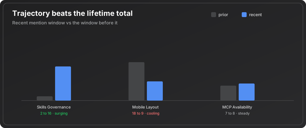
Direction changes the value of a demand pool more than size does. A rising problem of modest volume can be worth far more than a huge problem in decline, because you are buying the future of the curve, not its past. Reading a category’s zoomed-out momentum, the same way our note on developer pain points in 2026 reads the whole complaint stream for what is moving, keeps you from anchoring on a stale total.
Instrument 3: breadth across independent sources
The third instrument fixes volume’s worst distortion: the difference between a hundred people with a problem and one very loud person with a hundred messages. Breadth counts how many separate, unaffiliated teams raise the same complaint. A demand pool spread across many independent projects is a durable market. The same volume coming from two or three noisy accounts is a support ticket wearing a costume.
The contrast is visible directly in the feed.
| Signal | Volume | Independent projects | Reads as |
|---|---|---|---|
| Improving README Documentation and Structure | 218 | 117 | ✓ Separate teams arriving at the same wall without coordinating |
| Need for Dark/Light Theme Toggle | 54 | 33 | ✓ Broad enough to be a market |
| GitHub API Rate Limit Indicator | 16 | 7 | ✗ Confined to a handful of teams, whatever its intensity |
Breadth is your cleanest early proxy for how many buyers exist, and it is the reading most likely to disagree with raw volume. When it does, trust breadth. For the deeper mechanics of reading this signal to spot open markets, our guide on how to find underserved developer niches takes the breadth reading apart in detail.
Instrument 4: the smoke test you run yourself
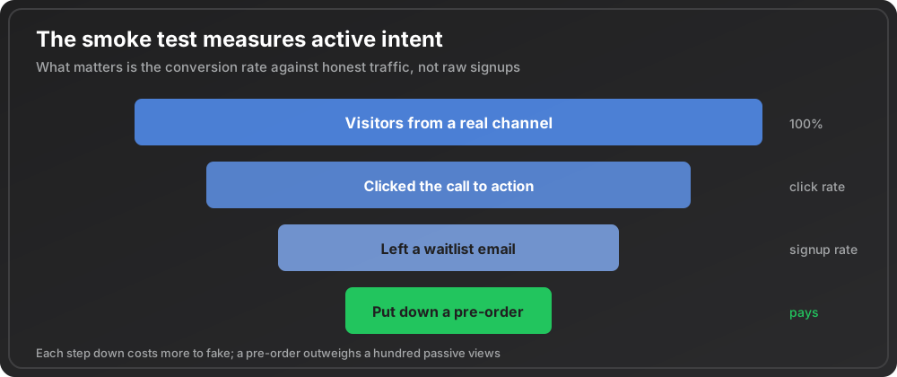
The first three instruments read demand that already exists in public. The fourth generates a fresh reading on your specific framing, and it is the first one that costs you an afternoon rather than a query. A smoke test is a landing page that describes the product as if it were real, with a single call to action, pointed at a small amount of traffic. What you measure is the conversion rate from visitor to intent: an email on a waitlist, a click on a fake “start now” button, a reserved spot. The idea, sometimes called a fake-door or minimum viable product test, converts vague interest into a countable action.
The number that matters is the conversion rate against traffic you did not curate, not the raw signup count. A hundred visitors and twelve emails is a very different signal from ten thousand visitors and twelve emails. Run the traffic through a channel your real users live in, not your own audience of friends, or you will measure your reach rather than the market’s appetite. A smoke test is deliberately active demand: nobody clicks “reserve my seat” by accident, which is what makes it a stronger reading than a passive view count. It is the cheapest way to test whether the framing you would actually market converts, and it pairs naturally with the scoping discipline in our validation playbook for a SaaS idea.
Instrument 5: willingness to pay
The final instrument measures the deepest layer of demand, the one that separates a nice-to-have from a business: will people part with money? Interest is cheap and abundant; payment is scarce and honest. You do not need a working product to probe it. A pre-order or a refundable deposit turns a waitlist into a revenue test. A short pricing survey, structured with something like the Van Westendorp price sensitivity method, maps the band of prices your prospects consider reasonable rather than betting the company on a single guessed number.
The polite yes
Ask someone whether they would pay and they will spare your feelings. Ask them to put down a card, or to name the exact price at which the product becomes too expensive to consider, and the answers get specific fast.
Willingness-to-pay readings are lower in volume than the earlier instruments, because fewer people reach them, but each one is worth far more, since it filters out everyone whose interest evaporates at the checkout. A demand estimate with no willingness-to-pay reading in it is an estimate of curiosity, not of a market.
Composing the instruments into one estimate
No single instrument is a verdict. The skill is combining them, because they measure different faces of the same thing and their disagreements are where the truth hides. A workable composite weighs four factors: how large the demand pool is (volume), how hard the pain bites (intensity), how many separate teams feel it (breadth), and which way the curve is heading (recency). A problem that scores well on all four is rare and worth building into. A problem that spikes on volume but collapses on breadth is a mirage.
That composite is exactly what a pain score is meant to approximate. When our feed assigns “Structural Quality Governance in Skills” a score of 112.2, it is folding a small but violently accelerating pool into a single comparable number, which is why a topic with a volume of only 30 can outrank a topic with a volume of 150. You do not need our score to do this; you need the habit of never reading one instrument in isolation. Line up all five readings for each idea, and the ranking that emerges survives contact with reality far better than any single metric. The same triangulation underpins the way our signals of product-market fit guide treats no one number as proof on its own.
Where demand measurements deceive you
Every instrument has a failure mode, and naming them in advance is how you avoid fooling yourself.
| Failure mode | What it looks like | The correction |
|---|---|---|
| Stale volume | ✗ A large total that is the fossil of a problem the ecosystem already solved | Cross-check every big number against its recent window, because a dead pool and a living one look identical until you read the trajectory |
| Loud minorities | ✗ High volume from few sources, which is intensity rather than size | Trust breadth: if it does not confirm volume, the market is smaller than the threads make it look |
| Vanity conversions | ✗ A smoke test run against your own audience | Send strangers, because people who already like you will convert on anything |
| The courteous survey | ✗ Stated willingness to pay running well above revealed | Weight a refundable deposit far above a survey checkbox, and a checkbox far above a verbal "sure, I'd buy that" |
| Snapshot blindness | ✗ A one-day pull, on a feed whose daily volume swings from 594 to 2,523 mentions | Measure over a window, not an instant, and treat the trend as the signal |
That peak of 2,523 landed on 13 July 2026, against a partial-day reading of 594 at the other end of the same feed, which is how far a single pull can travel. For the broader research frame that these instruments plug into, our tips for market research piece sets the context.
Run the five instruments in order, cheapest first, and stop the moment the readings agree that demand is thin: that is a saved quarter. When they agree it is real and rising and broad and people will pay, you have something rarer than a good idea. You have a measured one.
Reading existing volume, recency, and breadth by hand across four platforms is the slow part, and it is exactly what EchoSift automates. It ingests developer complaints from GitHub, Stack Overflow, Hacker News, and Bluesky, clusters them into recurring pain patterns, and attaches volume, growth, and the number of independent projects to every cluster, so the first three instruments are columns you read instead of a census you run by hand.
This article was drafted with AI assistance and reviewed against EchoSift’s proprietary signal data before publishing.