Product-Market Fit Questions: What to Ask and What the Answers Mean
The product-market fit questions worth asking, the Sean Ellis 40 percent test in full, and how to read demand in public before you have users to survey.
 Alessio Persico Founder of EchoSift



“How would you feel if you could no longer use this product?” That one line, and the percentage of your active users who answer “very disappointed”, is the closest thing anyone has to a working measurement of product-market fit. Sean Ellis set the bar at 40 percent after benchmarking close to a hundred startups, and it survives because it asks people about loss rather than about enthusiasm. Enthusiasm is cheap, and people hand it over to be polite. Losing a tool you rely on is a cost you can actually feel.
What follows is the full set of questions worth asking, who to ask them to, what each answer is good for, and the two ways a healthy-looking score can still mislead you. It is written for developer-tool and dev-facing SaaS founders, who have one thing the standard question lists never account for: every question here needs users you already have, and for developer tools the demand for a category is documented in public long before you have a single one.
The four questions, and who to ask them
Ellis ran early growth at Dropbox, LogMeIn and Eventbrite before building the survey around that question. The version most teams copy is Superhuman’s, documented in First Round’s account of how Superhuman built an engine to find product-market fit, which is also where the 40 percent benchmark and Ellis’s screening rule are recorded. Four questions, plus one decision about who receives them.
Screen who you ask
Only users who reached the core of the product. Ellis's rule is people who used it at least twice in the last two weeks, and roughly 40 responses is enough to be directionally right.
"How would you feel if you could no longer use this product?"
Offer exactly three options: very disappointed, somewhat disappointed, not disappointed. The share picking "very disappointed" is your score, and 40 percent is the bar.
"What type of people do you think would most benefit from this?"
Answered in the respondent's own words. This is where your real segment comes from, rather than the one on your pitch deck.
"What is the main benefit you receive from it?"
The phrasing the "very disappointed" group uses here is the value proposition worth putting on the page.
"How can we improve it for you?"
Read it split by group. Requests from the very disappointed group protect the core; requests from everyone else usually pull you away from it.
Superhuman’s first run came back at 22 percent, well under the bar. The useful part is what came next. Instead of treating 22 percent as a verdict on the whole product, they read the second question, found the segments hiding inside the very disappointed group, and rebuilt the roadmap around them. The score moved to 33 percent, then to 58 percent within three quarters. So a result under 40 percent is an instruction to narrow rather than a judgment on the product: segment the very disappointed answers, find the group already getting the value, and build for them until the score follows.
Two cautions before you trust a number that comes out of this. Survey each user once, because re-polling people who already answered drifts the benchmark. And keep track of who is in the sample at all: you are asking people who signed up and stayed long enough to use the product twice, a group selected for liking you.
What the score alone will not tell you
A survey score is a self-report, and self-reports lag behavior. The cleanest definition of product-market fit is still the oldest one: the market pulls the product out of you faster than you can push it out to them. Everything useful about fit follows from that single word, pull. Before fit, growth is something you do. You recruit each user, you chase each renewal, and the moment you stop selling the graph flattens. After fit, growth is something that happens to you. People you never contacted show up, and people you did contact keep coming back without a reminder.
That reframing tells you which signals are real and which are theater. Any metric that only moves when you push is a proxy for your own effort. The signals that matter are the ones that move when you step back. A referral you did not ask for, a cohort that returns on its own, a support thread where a user is teaching another user how to get more out of the product: those are pull. They are harder to manufacture, which is exactly why they are worth trusting.
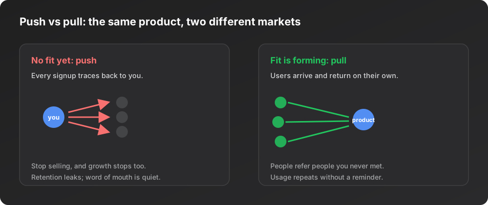
Paul Graham makes the same point from the growth side in Startup = Growth: a startup is a company designed to grow fast, and sustained organic growth is the clearest outside evidence that people want what you built. Marc Andreessen’s original framing in The Only Thing That Matters is bleaker and more useful: when you have fit, you can feel it, because usage grows faster than you can add servers and money piles up. When you do not, you feel that too, and no amount of dashboard optimism fixes it.
The vanity trap: signals that feel like fit but are not
The reason fit is so easy to fake to yourself is that the loudest, easiest numbers sit at the bottom of the signal ladder. Signups, page views, stars, and likes all go up when you do more marketing, and they all say nothing about whether anyone came back. A launch spike is the classic false positive. You post somewhere large, a wave of curious people arrives, your chart hits an all-time high, and three weeks later the only accounts still active are your own test users.
We see the shape of that spike-and-fade in our own instrumentation. The EchoSift feed on 6 July 2026 read like this, across 4 sources.
The daily mention timeline is spiky by nature, and that jump on 3 July faded partially over the following days. A spike in raw volume is interesting, but on its own it is a bottom-rung signal. It tells you attention arrived. It does not tell you anyone stayed. The same logic applies to your own product: a signup surge is the start of a question, never the answer.
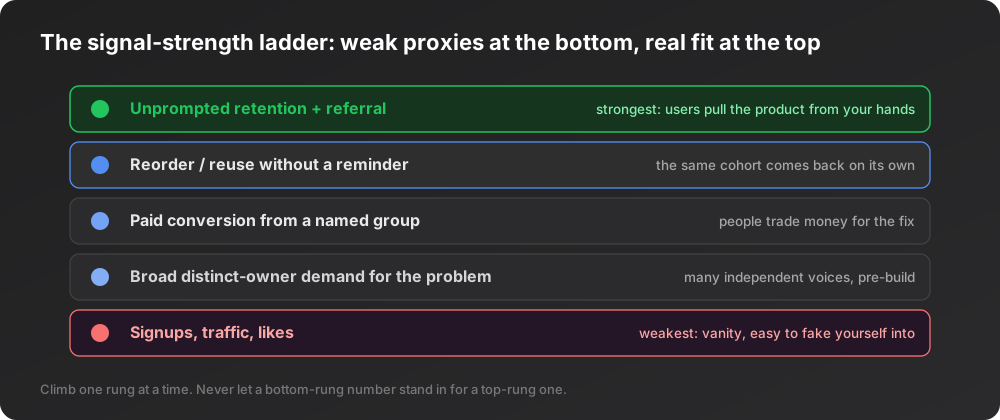
The way out of the vanity trap is to always trade a bottom-rung number for the next rung up. Do not report signups; report how many of last month’s signups are still active this month. Do not report a traffic spike; report whether the cohort that arrived in the spike behaves like the cohort that arrived before it. Every rung you climb costs more to fake, and fit lives near the top.
The question you can answer before you have users
Every question above assumes a user base. The survey needs people who already reached the core of the product twice in a fortnight, so the whole method is unavailable at the exact moment it would change your decisions most: before you build. For developer tools there is a substitute, because the people who will use your product are already writing the problem down in public, on GitHub, Stack Overflow, Hacker News and Bluesky.
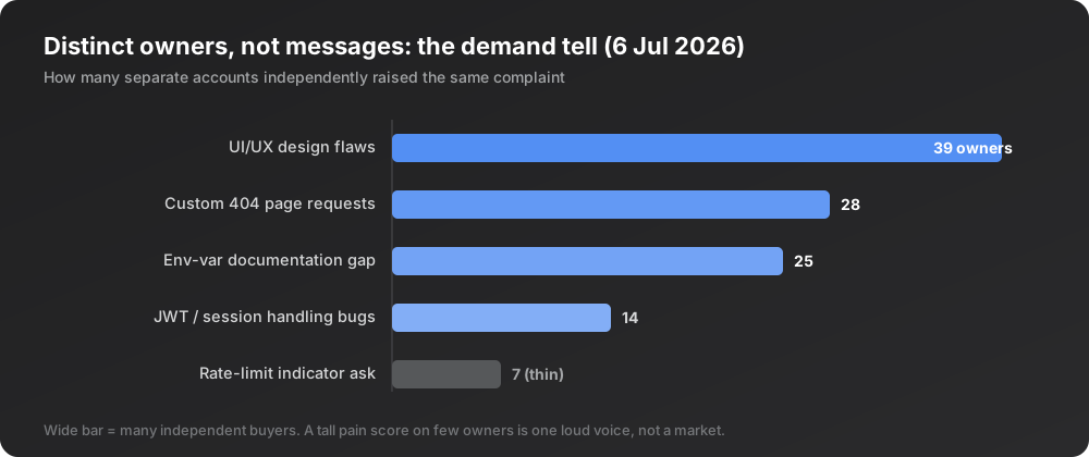
The reading that matters in that stream is not how loud a complaint is, but how many separate accounts raise it independently. Volume and distinct owners come apart, and the gap between them is the signal. On the EchoSift feed on 6 August 2026 the widest cluster was “Skill integration and verification challenges”, carrying 123 mentions from 71 distinct owners. A cluster of almost the same size, “UI layout and responsiveness issues”, carried 104 mentions from only 37 owners. Same volume band, roughly half the independent demand. Read as a volume-to-owner ratio it is 1.7 mentions per owner against 2.8, which is the difference between a wide problem and a smaller group saying the same thing more often.
That is a demand reading you can take with zero users, and it answers something the survey structurally cannot: whether a market exists at all, or only a handful of unusually loud people. It is a necessary condition and not a sufficient one. It tells you the category has pull. It says nothing about whether your particular product will earn any of it.
What a wide problem looks like in a live feed
Ranked across a whole feed, that gap sorts clusters into markets and bugs. The 6 July 2026 feed made the contrast concrete: the broadest cluster by independent demand was “Persistent UI/UX Design Flaws”, carrying a volume of 99 mentions, but the number that matters is 39 owners. Thirty-nine separate accounts, not thirty-nine messages, hit the same wall.
| Cluster on the 6 July 2026 feed | Pain score | Distinct owners | Reads as |
|---|---|---|---|
| Persistent UI/UX Design Flaws | 124.9 | 39 | ✓ The broadest independent demand in the feed |
| Custom 404 Page Improvement Requests | 79.3 | 28 | ✓ A wide independent base |
| Need for comprehensive environment variable documentation | 74 | 25 | ✓ A wide independent base |
| JWT Token Handling and Session Management Issues | 71.1 | 14 | ~ A legitimate bug, not yet a market |
| Codex review failures and misconfigurations | 68.2 | 13 | ~ A legitimate bug, not yet a market |
Wide independent demand is the pre-build version of pull, and it is what separates the top of that table from the bottom. The last two clusters are real problems that people hit. Neither is yet the broad market that thirty-nine independent voices signal.
Reading complaints tells you the category has demand, which is where the survey questions pick the story back up once you have users to ask. What it does early is stop you from mistaking your own excitement for the market’s. If dozens of distinct people are not already documenting a version of the problem you want to solve, the burden is on you to explain why the pull will appear once you build. This is the same distinct-owner discipline we use throughout validation. Our guide on how to do customer discovery walks through turning those clusters into interviews that can return a no, and the wider read on developer pain points in 2026 shows how the complaint stream maps to real opportunity.
The post-launch signals that actually confirm fit
Once you have shipped, the pre-build demand signals hand off to behavioral ones, and behavior is where fit is confirmed or denied. Four signals carry most of the weight, and all four are versions of pull.
| Pull signal | What it measures | Why it resists faking |
|---|---|---|
| Retention that flattens above zero | Whether a stable core comes back unprompted | ✓ Almost impossible to manufacture, and the most trustworthy of the four |
| Organic acquisition | New users who trace to no campaign you ran | ✓ The product is being passed hand to hand |
| The Sean Ellis test, near 40 percent "very disappointed" | How much your active users would miss you | ✓ It asks about loss, not about enthusiasm |
| Depth of use, the core action repeated | Habit rather than trial | ✓ Reorder behavior cannot be bought with ad spend |
The first row carries the most weight. Plot the percentage of each weekly or monthly cohort that is still active over time: without fit, every cohort curve slides toward the floor, and with fit the curves bend and level off at some non-zero plateau, which means a stable core keeps using the product on its own.
The third row is the survey from the top of this piece, used as one input among four rather than as the verdict. The fourth is the consumption view: the same accounts returning to do the core action repeatedly, not once.
Watch what all four have in common. Not one of them is a headline number that goes up when you spend more on ads. Each measures whether the market keeps acting on the product after you stop acting on the market. That is the whole test, restated four ways.
How to instrument fit without fooling yourself
The practical failure is measuring the wrong thing precisely. Teams build beautiful dashboards around signups and sessions and then wonder why the confident numbers never translate into durable growth. The fix is to pick, in advance, the one pull signal you will treat as your source of truth, and to demote everything else to context. For most developer tools that anchor should be cohort retention, because it is the least gameable and the most direct.
Then set the honesty conditions before you look.
Name the no before you look
Decide what a failure looks like: a retention plateau that keeps sliding toward zero, organic acquisition that stays near zero, a Sean Ellis result well under the threshold. If you name the failing outcome first, you cannot rationalize it away when it shows up.
This is the same falsification discipline that runs through our full validation playbook for a SaaS idea: a test only means something if it was allowed to fail.
Finally, keep reading the demand stream after launch, not just before it. The public complaints that told you a category had pull will also tell you when the ground is shifting, when a new cluster is rising, or when the problem you solved is being absorbed by a platform. Fit is not a finish line you cross once. You can lose it, and the same distinct-owner signal that helped you find it will warn you when it starts to fade.
The short version
Ask the four questions. Screen for users who reached the core, count the share who would be very disappointed to lose the product, and use the free-text answers to find the segment that already loves it. Then check the score against behavior, because product-market fit is not a number on a dashboard. It is a change in who is doing the work of growth. Before fit you push, and the graph depends on your effort. After fit the market pulls, and the graph keeps moving when you step back. Before you have anyone to survey at all, read the demand in public through distinct-owner counts. Treat signups and traffic as questions, never answers. The signal you can trust is the one that survives you doing nothing.
Reading a live complaint stream for distinct-owner demand is exactly the manual work EchoSift automates. It ingests developer complaints from GitHub, Stack Overflow, Hacker News, and Bluesky, clusters them into recurring pain patterns, and ranks them by how many separate accounts are behind each one, so the pre-build demand signal is there before you commit to building.
This article was drafted with AI assistance and reviewed against EchoSift’s proprietary signal data before publishing.