Best Selling Products: 10 SaaS Winners Builders Should Study in 2026
A builder's lens on the best selling SaaS products of 2026, the specific pain each one solved, and why the pattern matters for founders looking for the next category.
 Alessio Persico Founder of EchoSift



Imagine pulling up the annual SaaS revenue ranking with the goal of spotting the next category before it scales. You get seat counts, market-share percentages, and a timeline of funding rounds, and none of it tells you what the products actually share. The list ends up useful for analysts and useless for the founder trying to read the room earlier. Every best-seller on it earned its position by solving a specific pain that turned out to generalise across an entire market, and that fossil record is the part worth studying.
The frame we use at EchoSift is the inverse of the marketing one. A best-selling SaaS product in 2026 is, almost without exception, the productised answer to a single piece of cross-vendor developer pain. The pain came first. The product came second. The marketing came third. Read the products in that order and you stop seeing brands; you start seeing a small library of pains that the market has already paid to solve. That library is the most reliable input for deciding what to build next.
The external data on this pattern is strong and easy to verify. The Stack Overflow Developer Survey 2025 ranked the tools developers most want to keep using, and the names that surface year after year are the same names that the SaaS top-of-market list now indexes. The overlap is not coincidence. Tools that survive the survey are tools that solved a specific pain durably enough to outlast the next wave of substitutes. That is also what makes them best-sellers.
Strong founder ideas almost never look like a smaller version of a current best-seller. They look like a wedge into a pain the best-seller did not bother solving, in a segment the best-seller priced out of.
The mistake I see most often
Founders study a best-seller list as a verdict on what to build, when it is a record of what has already been built.
If you are working backwards from these products toward your own bet, our guide on how to find startup ideas walks through the same pain-first method applied to a blank page. The 10 SaaS winners below are the ones I would study if I were trying to read the pain library in 2026, with a builder’s eye for what comes next rather than a consumer’s eye for who is currently leading.
Table of Contents
- 1. Stripe, a billing API a developer can read in fifteen minutes
- 2. Datadog, one place to look when production breaks
- 3. Notion, the writing surface that became the company wiki
- 4. Linear, issue tracking that respects the engineer’s calendar
- 5. Vercel, preview URLs as the default review workflow
- 6. Clerk, auth components instead of an auth project
- 7. Plausible, analytics that does not require a cookie banner
- 8. Cursor, the editor that treats the agent as a co-author
- 9. PostHog, the product analytics that comes with feature flags attached
- 10. Resend, transactional email built by people who shipped one before
1. Stripe, a billing API a developer can read in fifteen minutes
The pain Stripe addressed is older than most of the founders who use it today. Before 2010 every team that wanted to accept money built an integration against a payment processor that assumed they were a Fortune 500 company with a procurement department, a settlement bank, and a dedicated risk team. The substitutes were PayPal, which was a developer experience embarrassment, and Authorize.net, which was a sales process. The pain was that the actual code path of “take a credit card on the internet” took six weeks and required a lawyer.
What Stripe productised
Stripe productised the read-fifteen-minutes-and-ship version of that code path. The original launch promise was seven lines of code to accept a card. Every product decision since has been graded against the same constraint: does the new feature preserve the property that a competent developer can read the documentation and ship in an afternoon. The API decisions cascade from there. Idempotency keys, webhook replay windows, structured error codes, and dashboard transparency all exist because the founders treated developer reading time as the scarce resource. Their own foundational essay on idempotency is still the cleanest articulation of why this matters at a system level.
What Stripe actually won on
The competition tried to win on rate cards. Stripe won on documentation, because the founders treated developer reading time as the scarce resource.
What to validate before building the Stripe of a vertical
The “Stripe for X” pitch has been over-applied for a decade. Most of the failures share a single pattern. Founders identified a vertical where payments are awkward but did not check whether the awkwardness was the actual bottleneck for that vertical’s builders. The cheap filter we run before spending time on these wedges reads that vertical’s own community the way we do when we mine Stack Overflow for SaaS ideas.
The fifteen-minute test
Can a competent builder in that vertical read the existing payments docs and ship in an afternoon? If yes, payments is not the wedge, regardless of how much money flows through them.
The actual top complaint
Pull the most-complained-about constraint in that vertical's main developer community. If it has nothing to do with integrating payments quickly, payments is not the wedge.
The unit economics of the workaround
If the current substitute is a Google Sheet and a manual reconciliation, the buyer has accepted the cost. Replacing it requires a step-change improvement, not parity.
Practical rule: Stripe won because it removed a real developer cost, not because it had cleaner branding. If you cannot name the developer cost your “Stripe for X” removes, you do not have a wedge yet.
2. Datadog, one place to look when production breaks
The pain Datadog solved is the one every engineering team encounters around the moment they cross five services in production. Before Datadog the standard pattern was a constellation of disconnected tools, one per layer, each with its own dashboard and its own permissions model. When something broke at 3 a.m. the on-call engineer had to switch between four tabs to triangulate the cause. The pain was not the lack of any single tool. The pain was the cost of switching between them under time pressure.
What Datadog productised
Datadog productised the single pane of glass without pretending the underlying layers had merged. Metrics, traces, logs, and synthetics live in distinct backends but are joined at the query layer. The product decision that made it work was treating correlation as a first-class primitive. A trace anchors logs; a log anchors a metric; a metric anchors a synthetic. The on-call engineer in 2026 expects this experience as a default; in 2016 it was a competitive moat. New Relic’s 2024 Observability Forecast shows why this matters as a category: a majority of organisations are now actively consolidating observability tools to cut complexity and cost, which is exactly the buying behaviour that rewards the vendor with the tightest joins.
What to validate before building the Datadog of a vertical
The “Datadog for X” pitch is structurally similar to “Stripe for X” and shares the same trap. Picking a smaller domain does not automatically reduce the work of joining heterogeneous data. Before spending a quarter on an observability adjacency we run three checks, the first of them as a problem interview that can return a no and the second as the opening move in pricing a developer tool.
The on-call story
Interview five engineers who would be the primary user and ask what they look at first when something breaks. If their first move is not "switch tabs", observability is not their bottleneck.
The data join cost
Pricing here is driven by ingest volume, not feature count. If you cannot price the ingest curve in 2026 dollars, you cannot price the product.
The compliance gap
Vertical observability often wins on residency and audit rules the horizontal player will not address. A real regulatory anchor in the vertical is your moat.
Practical rule: “Datadog for X” is a viable wedge only when the buyer is paying a measurable switching cost between tools today. If they are not, you are competing on aesthetics, which is a slow death in tooling.
3. Notion, the writing surface that became the company wiki
Notion’s success in 2026 still surprises people who watched it launch as a personal note app. The pain it productised is one the buyer rarely names in interviews because the workaround was so habitual that nobody recognised it as a pain. Most product teams maintained four parallel systems: a wiki, a docs tool, a lightweight database, and a personal note app. Each was tolerable in isolation. Together they produced a kind of low-frequency exhaustion where every piece of information lived in two places and was up to date in neither.
What Notion productised
Notion’s product decision was to treat the block as the universal primitive. A heading, a paragraph, a database row, an embed, and a toggle all share the same data model and the same query semantics. Once the block-as-primitive lands, the four tools collapse into one and the user’s mental model collapses with them. Names matter less than primitives. The companies that compete with Notion today, including its open-source counterparts, all converge on similar block-based architectures because that is the only architecture that solves the underlying pain. The marketing came later. The data model was the wedge.
What to validate before building the Notion of a category
The “Notion for X” pitch surfaces every quarter and usually loses. The pattern of failure is consistent. Founders ship a vertical knowledge tool, but the buyer in the vertical was not exhausted by their existing wiki, only mildly annoyed. The filter below is the one we use before spending time on a Notion adjacency:
The four-system test
Count the systems your target user opens in a typical day to track information about the same projects. Four or more is where the block-as-primitive pitch starts to resonate; three or fewer and the workaround is good enough.
The collaboration cost
Notion pays off most when more than one person edits the same document weekly. If the workflow is solo, the substitute is a Markdown file in a repo.
The export pressure
Vertical knowledge tools die when they cannot export cleanly. The first question the buyer asks in year two is "how do I get my data out", and the answer determines whether you keep them.
Practical rule: a Notion-style wedge works when the buyer has already accepted that they will replatform their knowledge tools every three years. If they have not, they will not buy you in year one no matter how good the editor is.
4. Linear, issue tracking that respects the engineer’s calendar
Linear’s place on the 2026 best-seller list is the cleanest example of a category that needed a serious incumbent reframe. The pain was that issue tracking, for a decade, had been designed for the program manager who needed to report on the engineering team, not for the engineer who actually had to do the work. The result was a tool the engineering team avoided, which then meant the tool had stale data, which then meant the program manager was reporting on fiction. Everyone lost.
What Linear productised
Linear productised the assumption that the engineer is the primary user, not the manager. Every product decision falls out of that. Keyboard shortcuts as a first-class citizen. Cycle planning that defaults to small batches. A data model where status transitions are cheap and noisy reports are expensive. Slack-style import for new accounts. The competing tools have been adding “Linear-style” features ever since, which is the clearest signal that the wedge was right.
The reframe that settled the category
The category leader is now usually the tool that disrespects the engineer's calendar least.
What to validate before building the Linear of a workflow
A “Linear for X” wedge is harder than it looks because the engineering-first design is not always the right primary-user choice for the new workflow. The filter below is what we apply before committing to one:
The current avoidance behaviour
Identify how often your target user opens the incumbent tool when not forced to. "Once a week and only by manager nudge" means you have the right wedge.
The keyboard test
Time your target user's main daily task in the incumbent. A mouse-bound task means the engineering-first reframe will likely land; an already keyboard-friendly one means the wedge is smaller than it looks.
The data-quality compounding
Incumbent fatigue produces stale data, which produces useless reporting, which produces more fatigue. A workflow with that loop repays the reframe fast.
Practical rule: Linear-style wedges work only when the primary user has been mis-identified by the incumbent. Confirm the misalignment is structural before assuming it.
5. Vercel, preview URLs as the default review workflow
Vercel’s claim on the 2026 best-seller list is built on a single product decision that the wider deployment category had treated as a “nice to have” for almost a decade. The pain was that frontend code review without a deployed environment was theatre. The reviewer either trusted the screenshot, ran the branch locally, or skipped the visual diff entirely. Frontend bugs caught in production were the result of a process that pretended to review what it had not actually seen.
What Vercel productised
Vercel productised the assumption that every pull request gets a deployed URL, automatically, without ceremony. Once the URL is the default, the review workflow shifts. The reviewer clicks the URL, exercises the change, and leaves a comment grounded in actual behaviour rather than imagined behaviour. The platform decisions cascade from there. Build caching aggressive enough to keep the URL appearing in under a minute. Domain wildcard handling. Branch-specific environment variables. Each is a quiet supporting decision for the preview-URL primitive.
What to validate before building the Vercel of a stack
Multiple categories now resemble Vercel’s wedge from a distance. Backend deployment, edge functions, full-stack frameworks, and AI-first hosting platforms all reach for the same preview-URL primitive. The filter below is what we use to separate real Vercel-style wedges from imitations:
The current review modality
Ask reviewers how they evaluate visual or behavioural changes today. "I look at the screenshot in the PR" is a wedge; "I deploy to staging from CLI" means the substitute is good enough.
The build budget
Preview URLs are economical only when builds are short. If the stack you are targeting has 20-minute builds, no platform decision will produce a per-PR URL workflow.
The framework compatibility curve
Vercel grew alongside Next.js because the two shipped together. A new platform wedge usually needs a partner framework to take off, not just a deployment story.
Practical rule: the preview-URL wedge works only when the build budget allows it and the review behaviour already wants it. Both conditions are necessary.
6. Clerk, auth components instead of an auth project
The auth space is one of the loudest pain markets in the developer ecosystem, and Clerk’s appearance on the best-seller list shows what happens when a vendor reads the actual complaint clearly. The pain was not “we cannot find an auth provider”. Auth0, Okta, and Cognito had been available for years. The pain was that integrating any of them still produced a multi-week project that the team had to maintain forever. Founders rolling their own paid for it with security bugs; founders integrating Auth0 paid for it with rework every time the UI requirements changed.
What Clerk productised
Clerk productised the assumption that auth is a UI component, not a project. The shipped artefact is a <SignIn /> you drop into the layout and a hosted user object you read from a hook. The platform decisions cascade. Drop-in components for every common auth surface. Session and JWT handling that does not require a backend SDK. A user-management dashboard that ships with the components rather than as a separate purchase. The competing wave of auth-as-component tooling that followed Clerk is the clearest signal that the wedge was correct.
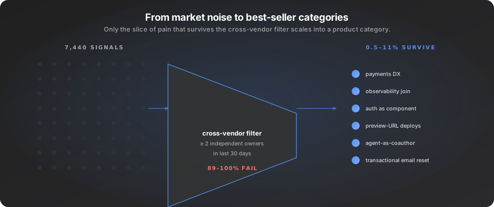
Our own pipeline puts a number on how rare that is. Across eight developer macro areas in the 30 days ending June 7, 2026, this is what survived the cross-vendor filter.
Everything else was single-owner. That thin band is the slice of pain that has historically produced best-selling products, and auth sits inside it, which is why an auth-as-component wedge could land in 2026 even though the category appeared crowded. The caveat matters as much as the number: “two or more owners” is a deliberately low bar, and raising it to five owners collapses the surviving signal by roughly 70%, so the rank order of categories holds up while the absolute count does not. Read that window as history rather than as a constant, because the same pipeline now holds 37,271 clustered signals with 2,752 added in the trailing seven days, so the band moves as the base grows.
Source: EchoSift internal signal data, 2026-05-09 → 2026-06-07, 7,440 clustered pain signals across eight macro areas.
Re-running the same filter a month later shows how much the top of the list moves.
| Widest cross-vendor cluster, 2026-08-05 | Mentions | Independent owners |
|---|---|---|
| Merge queue: required checks not enforced before a merge lands | 87 | 60 |
| UI layout and spacing | 126 | 58 |
A month earlier, on the 2026-07-05 snapshot, that UI cluster was the widest complaint in the pipeline at 92 mentions from 35 independent project owners, and the merge-queue bug did not hold the top spot. Two clusters sitting near 60 distinct owners inside a corpus of 37,271 clustered signals is the shape that later productises into a best-seller, because breadth across owners is what separates a durable category from one team’s private annoyance. The reshuffle itself is worth noticing: owner counts that move that far in four weeks are being measured continuously, not asserted once. If you want to see how the same owner-count lens applies specifically to tooling, we mapped it in developer tools opportunities for 2026.
What to validate before building the Clerk of an identity layer
Auth is one of the few categories where a new entrant can land in 2026 without a contrarian thesis, simply by reading the integration complaint better. The complaint is still live on the 2026-08-05 snapshot: a JWT token expiration handling cluster carries 29 mentions from 18 independent owners, alongside an OAuth authentication cluster at 54 mentions from 15 owners. The filter we use:
The integration time test
Ask three teams how long their last auth integration took, in person-weeks. A median above two weeks means the component wedge is open; under one week the substitute is good enough.
The compliance surface
In regulated verticals the component pitch is incomplete without SOC2 and HIPAA support out of the box. The wedge collapses if compliance is sold separately.
The session-management failure modes
Ask how the team handles JWT expiry, refresh-token rotation, and session revocation. "We wrote a wrapper" means the component pitch lands hard.
Practical rule: an auth wedge in 2026 is about removing weeks from the integration, not about a new mental model. Verify the weeks exist before commitment.
7. Plausible, analytics that does not require a cookie banner
Plausible’s claim on the best-seller list is the rare case of a category leader that won by deciding to be smaller. Google Analytics 4 became the dominant analytics product roughly a decade ago, and every privacy-conscious team since then has either tolerated it, paid a developer to wrap it, or accepted the cookie banner as a tax. Plausible’s reframe was to ship a product that did less, on purpose, in exchange for not requiring a cookie banner at all. The underlying regulatory pressure has been documented for years; the European Data Protection Board’s guidance on cookie use is the canonical reference for why a consent-free analytics stance has a real legal moat in 2026.
What Plausible productised
Plausible productised the assumption that simple, privacy-friendly analytics is what most teams actually need, even though the market signal had been “more features”. The product is a single page with pageviews, sources, and conversion goals. There is no user-level tracking, which means no cookie banner is required in most jurisdictions. The pricing is a flat monthly fee, not a per-event meter. Each of these decisions is a refusal to compete on the dimensions GA4 leads on, in exchange for owning the “small site that wants honest numbers” segment definitively.
What to validate before building the Plausible of a metric
Plausible-style wedges are tempting because they look easy. They are not. Choosing to be smaller is a strategic discipline that most founders cannot hold for the eighteen months it takes to land. The filter below is what we use to separate legitimate small-by-design wedges from “we ran out of features” stories:
- The strategic absence: name three features the incumbent has that you will deliberately not ship. If you cannot, you do not yet have a discipline that can survive growth pressure.
- The compliance moat: small-by-design wedges often hide a regulatory advantage. If GDPR, HIPAA, or PCI compliance is materially easier in your design, the wedge is durable.
- The pricing reframe: per-seat or flat pricing is part of the wedge. If you replicate the incumbent’s metered model you have given up the strategic absence.
The discipline a small-by-design wedge demands
A Plausible-style wedge is durable only when the founder treats every "missing feature" request as a confirmation rather than a critique. Verify you can hold that line before committing.
8. Cursor, the editor that treats the agent as a co-author
Cursor’s appearance on the best-seller list is the youngest entry in this set and the one most likely to be misread. The JetBrains State of Developer Ecosystem 2024 report, which found that roughly half of developers now regularly use an AI assistant for coding, shows the underlying demand shape: AI-assisted coding moved from “tried once” to “daily driver” inside a single survey cycle, which is the kind of step change that creates a category leader almost overnight. The pain Cursor solved was not “I want an AI completion in my editor”. Copilot had been shipping that since 2021. The pain was that completion was the wrong primitive once the underlying model was good enough to author rather than suggest. The editor became the integration surface that the assistant lived inside; treating the assistant as a co-author rather than a typeahead engine was a UI bet, and the bet paid.
What Cursor productised
Cursor productised the assumption that the agent is a participant in the file rather than a completion engine on top of one. The shipped product decisions follow. Multi-line generation with structured edit proposals. Agent-driven file navigation. Inline diff acceptance rather than inline insertion. A chat surface that holds context across the project. Each is a small UI choice that signals “the agent edits, you accept”. Competing editors are now reaching for the same metaphors because the metaphor is correct, not because Cursor’s brand is dominant.
What to validate before building the Cursor of a domain
Cursor-style wedges are the single most over-pitched category in 2026 because every founder with a model API key can ship a vertical agent. The filter below is what we use before taking one seriously:
- The model-quality threshold: the wedge works only above a specific underlying model quality. Verify your target task is on the right side of that threshold before designing the UI.
- The editing surface: the wedge requires that the user’s existing workflow has a primary surface the agent can edit inside. If the workflow is split across five tools, the editor-as-host metaphor does not transfer.
- The acceptance model: users will not accept invisible edits at scale, even from a good model. Design the acceptance surface before designing the generation.
Where Cursor-style pitches fail
The wedge is about the acceptance surface, not the model. Most failed pitches in this category arrive with a strong model and a missing acceptance UI.
9. PostHog, the product analytics that comes with feature flags attached
PostHog’s place on the best-seller list is built on a single architectural decision that the rest of the product-analytics category had treated as out of scope. The pain was that running an experimentation workflow in 2024 typically required three vendors. Amplitude or Mixpanel for the analytics, LaunchDarkly or Flagsmith for the feature flags, and FullStory or Hotjar for the session replays. Each vendor’s data lived in a separate plane, which meant the loop from “ship a feature behind a flag” to “measure its effect” to “watch a user struggle with it” required a manual three-step integration project.
What PostHog productised
PostHog productised the assumption that the three vendors were one product trapped in three pricing pages. The shipped artefact is a single platform where the same event stream powers analytics, flags, and replays. The product decision that made it work was an aggressive open-source play that let teams adopt one slice at a time without buying the whole stack on day one. That play also cuts both ways for a new entrant: an open project publishes its own unmet demand, which is why reading product gaps in open-source tools is the cheapest way to see which layer a commercial platform still has to earn. The competing vendors have started bundling adjacent layers as a response, which is the clearest signal that the integration was the wedge, not any single layer.
What to validate before building the PostHog of a category
PostHog-style wedges work only when the existing vendor split is a historical accident rather than a real product boundary. The filter below is what we use to test the assumption:
The vendor count test
Ask three target users how many separate tools they use in a single experimentation workflow. Three or more, with no explanation of why, means the unified-platform wedge is open.
The data-shape compatibility
Check that the underlying events for each layer share a primary key. If they do not, your platform pitch hides a migration project for the buyer.
The pricing collapse
A unified platform must be cheaper per workflow than the sum of the disjoint vendors. Pricing that matches the sum leaves you competing on convenience alone, which is fragile.
Practical rule: a PostHog-style wedge is open only when the historical vendor split was an accident. If the split reflects a real product boundary, your platform will be worse at each layer than the specialist.
10. Resend, transactional email built by people who shipped one before
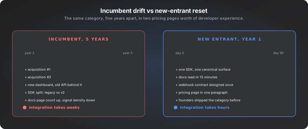
Resend’s appearance on the 2026 best-seller list is the clearest reminder that incumbents stop being incumbents the moment they let the developer experience drift. The pain in transactional email was not new. Mandrill’s shutdown in 2016 created a category gap, SendGrid filled it, and the developer experience slowly degraded through a decade of acquisition and consolidation. By 2023 the median developer integrating transactional email was spending more time on the SDK and dashboard than on the actual email logic. The substitute had become the pain.
What Resend productised
Resend productised the assumption that the founders’ own first integration of an email API is the canonical user journey. The product was built by people who had shipped transactional email at scale and remembered what they wished the original SDK had done. The result is an API that reads in one screen, a dashboard that surfaces the things the developer actually checks, and a webhook contract that does not require an aspirational integration. The marketing came later. The developer experience reset was the wedge.
What to validate before building the Resend of a forgotten category
Categories like transactional email accumulate developer experience debt every time an incumbent is acquired. The filter below is what we use to spot the next one in time:
The acquisition lineage
Trace the ownership of the current category leader over the last five years. Two or more acquisitions is a strong indicator that DX has drifted.
The first-integration time
Ask three recent integrators how long the API integration took. More than three days for a category that should be one hour means the wedge is open.
The complaint persistence
Pull the most-complained-about issue in the category's main developer community. The same complaint in 2020 and in 2025 means the incumbent has stopped addressing it.
Practical rule: Resend-style wedges are about reading the developer experience drift in an incumbent before that incumbent recognises it themselves. Verify the drift is structural, not a phase.
From best-seller study to your next bet
The thread across these ten products is a single observation. None of the 2026 best-sellers won by stretching to cover everything. Each one productised a specific developer pain that survived the cross-vendor filter, then refused to dilute the wedge as the company grew. Read the list as a pain library and the next move becomes a series of small bets, not a single category swing.
A second thread is that the best-sellers cluster around pains that are durable, not loud. The complaint that made Stripe land had been documented since the early 2000s. The complaint that made Resend land had been documented since 2016. Loud pains attract competitors quickly; durable pains attract them slowly, and the founder who reads the durable complaint first usually wins. The discipline is to count quarters of continuous complaint activity rather than weekly spikes. Most first products land in a narrow segment the leader priced out of, which is why our shortlist of niche SaaS ideas starts from the same underserved-segment logic these best-sellers were built on.
If you are looking for the next best-seller’s pain before it shows up on this kind of list, the practical filter is short, and its first step is the same count we use to measure demand for a SaaS idea before a line of code exists.
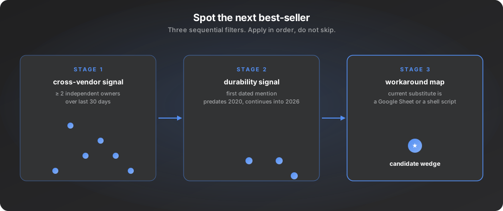
Where is the cross-vendor signal?
Pick a developer macro area and count complaints that appear from two or more independent project owners over the last 30 days. The slice that survives is the candidate library.
Where is the durability signal?
For each candidate, find the first dated mention of the same complaint shape. Predating 2020 and continuing into 2026 means the pain is structural.
Where is the workaround?
Map the current substitute, even when it is a Google Sheet or a shell script. The wedge sits next to the substitute, not on top of it.
If you are an indie founder or a dev-tool team trying to read this kind of signal at scale, EchoSift was built for that exact job. It clusters pain across GitHub, Stack Overflow, Hacker News, and Bluesky, surfaces the slice that survives the cross-vendor filter, and gives you a brief that names the durable shape of the complaint. The same lens that helped us spot the auth-as-component pattern early is what we built into the product. If your next product decision depends on reading the pain library accurately, that is the lens we would recommend.
This article was drafted with AI assistance and reviewed against EchoSift’s proprietary signal data before publishing. All signal figures are live aggregates from EchoSift’s feed as of the 2026-08-05 snapshot, except where a figure is explicitly dated to an earlier window.