How to Track Emerging Tech Trends (A Repeatable Signal Method)
A repeatable method to spot emerging tech trends early using growth, recency, and breadth signals from live developer data, before they show up in raw volume or headlines.
 Alessio Persico Founder of EchoSift



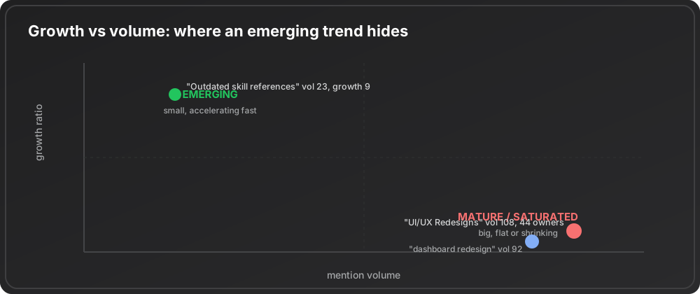
In EchoSift’s developer signal feed, the topic with the highest raw mention count on any given weekly snapshot is rarely the one worth building for. On a recent snapshot, “Need for Comprehensive UI/UX Redesigns” led the list at 108 mentions across 44 owners, while “Outdated skill references in Claude Code setup” sat at just 23 mentions but carried a growth ratio of 9. The second topic, a fraction of the size by raw count, is the emerging one. The interesting window for a small team to build and own a category closes right around the moment a trend tops the mention list and turns obvious to everyone scanning the same feed.
This piece is about the other approach: detecting a trend while it is still small, using the shape of its growth rather than its current size. It is not general market research and it is not demand measurement, both of which ask how big something is today. Trend tracking asks a different question: which small thing is accelerating fastest, and is that acceleration real or noise? The method below is three numbers read together, a weekly cadence, and a short list of ways the signal lies to you.
Volume is a lagging indicator, growth is a leading one
Start with the single most common mistake. People rank topics by how many times they are mentioned and treat the top of that list as the frontier. It is the opposite. High raw volume almost always means a topic is well past its emergence.
Three topics from one recent developer-signal snapshot make the point without any interpretation.
| Topic on the same snapshot | Volume | Growth ratio | Reads as |
|---|---|---|---|
| Need for Comprehensive UI/UX Redesigns | 108 | ✗ Flat to shrinking | Mature: you are late |
| Complete redesign of user dashboard interface | 92 | ✗ Flat to shrinking | Mature: you are late |
| Outdated skill references in Claude Code setup | 23 | ✓ 9 | Emerging: small and steep |
The two redesign topics are the largest in the set and, by their growth pattern, the most mature. Everybody already knows people want cleaner interfaces, and there is no edge in noticing it in 2026. The skill-reference topic is tiny beside them, yet it went from 1 mention in the prior window to 10 in the latest one. That is the shape of something new: small absolute size, steep slope. A founder who noticed the redesign topic is late. A founder who noticed the skill-reference topic is early.
The classic frameworks say the same thing in older language. The technology adoption life cycle and the diffusion of innovations model both describe adoption as an S-curve, where the profitable moment to enter is the steep early section, not the flat top. Volume tells you where a topic sits on that curve today. Growth tells you where it is heading.
The three signals you read together
No single number is enough. A high growth ratio on a base of two mentions is often a coincidence. A high volume with no growth is a mature market. You need three readings at once.
1. Growth ratio: the velocity
Growth ratio is the change in mention count between the previous window and the latest one. It is the closest thing to a speedometer. Here are the standout velocities in the snapshot, against the baseline for the whole set.
Three separate topics, all pointing at the same larger shift: tooling for coding agents is churning fast. One steep line is noise. Three steep lines in the same area is a trend. The last figure is the context that makes the first three mean something. The typical topic in this snapshot was slightly shrinking, so a topic growing several times over stands out sharply. Always read a single growth number against the baseline, never in isolation. The two agent topics were also small in absolute terms, 6 and 5 mentions in the latest window, which is exactly what you expect from something still early.
2. Recency: this window versus last
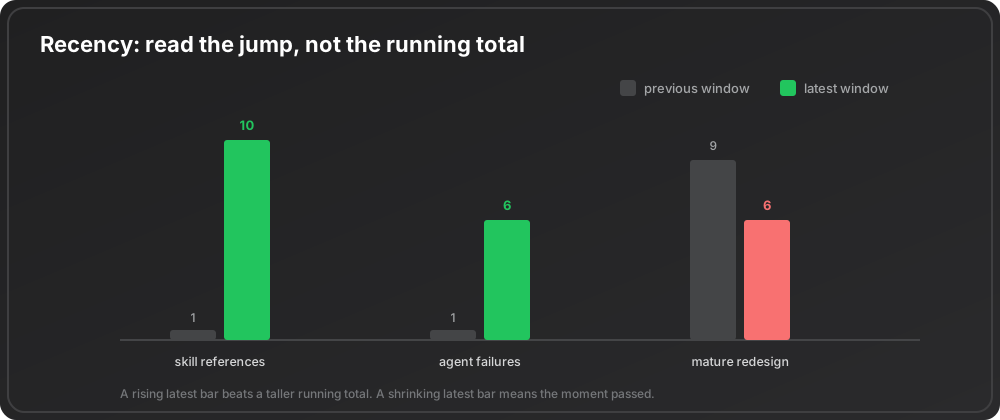
Recency is the raw comparison of latest-window mentions against prior-window mentions, before you turn it into a ratio. It catches things a running total hides. A topic sitting at a total of 100 mentions that were all logged months ago is dead. A topic with 10 mentions this window and 1 last window is alive, even though its total is a tenth the size.
This is why the skill-reference topic (10 this window, 1 last) reads as more urgent than a larger but stagnant one. You are looking for the jump, not the accumulation. When you scan a list, sort by the delta between the two most recent windows and ignore the lifetime total on the first pass.
3. Breadth: distinct owners, not distinct posts
The third number is the one most trend chasers skip, and it is the one that kills the most false positives. Breadth is the count of distinct people (owners) behind the mentions, not the count of mentions. A curve that looks like a trend can be one very active person filing the same complaint ten times.
The emerging topics above pass this test at a small scale: “Outdated skill references in Claude Code setup” came from 12 distinct owners, “Operational Failures in Claude Code Agents” from 9, and the AGENTS.md loading topic from 7. Those are modest but independent. Compare that to the mature redesign topics, which drew from 44 and 50 owners respectively. Breadth tells you whether a rising line is a real group forming or a single loud voice amplified. Divide mentions by owners before you trust any curve.
The volume trap, stated plainly
Put the three signals together and the most dangerous pattern becomes easy to name. A topic with high volume, high breadth, and a flat or negative growth ratio is a mature market. It looks attractive because the numbers are big. It is a trap, because everyone else can see the same big numbers, and the growth that would reward a new entrant already happened.
The redesign topics are exactly this: volume 108 and 92, owner counts of 44 and 50, and shrinking growth. If you were sorting by size, they would top your list. If you were sorting by opportunity, they would sit near the bottom. Knowing the difference is the whole skill. The same discipline underpins reading the signs of a saturated market and spotting developer tools opportunities before the field crowds in.
A weekly cadence you can actually keep
A trend method you run once is a hunch. A trend method you run every week is a system. Here is a cadence that fits in under an hour.
Pull the same data set every week
Consistency of source matters more than breadth of source, because trend detection measures change between snapshots and you can only measure change if the measuring stick stays the same.
Rank by growth ratio, filtered on owner count
Compute the three signals for every topic, then filter to topics with at least a handful of distinct owners. That pushes one-loud-user artifacts down and real early trends up.
Look for clusters, not single topics
A single steep topic is a candidate. Three steep topics in the same macro area, like the coding-agent tooling pain above, is a theme worth a week of your attention. Themes survive, individual topics often do not.
Watch the aggregate timeline for step changes
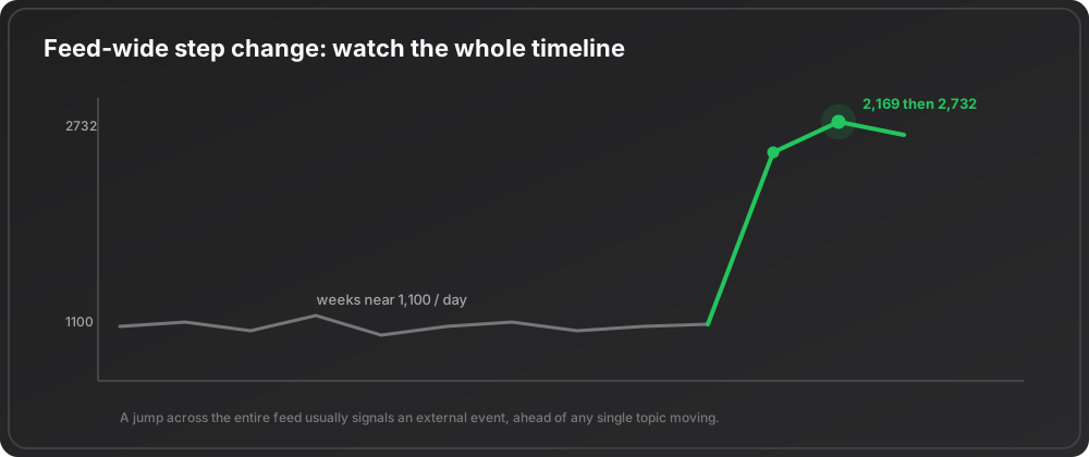
A jump across the whole feed, not just one topic, usually signals an external event worth understanding before it filters down into specific pains.
The snapshot behind this article drew from 4 sources and covered 29,231 total tracked signals, with 2,295 new ones in the trailing 7 days. The exact numbers matter less than the fact that they come from the same place every week. Its own step change was hard to miss: daily mention volume ran near 1,000 to 1,300 for weeks, then jumped to 2,169 on one day and 2,732 the next.
How the signal lies to you
Even a disciplined method produces false positives. Four failure modes account for most of them, and two already have names: the hype cycle describes attention peaking and then collapsing before real adoption, so a curve that rises fast can also fall fast, and Google Trends will happily confirm any term you were already sold on.
| Failure mode | What it looks like | The fix |
|---|---|---|
| Small-base illusion | 1 mention to 3 shows a growth ratio of 3, which looks explosive | Ignore ratios computed on a prior window of one or two mentions unless breadth is rising too |
| Single-owner spike | One motivated person manufactures a curve | Owner count, which is why breadth is not optional |
| Seasonal echo | Release cycles, conference weeks and quarter-end crunch repeat on a calendar | If it spikes every quarter it is a season, not a trend |
| Vanity search | The term you typed in is rising, because you chose it | Start from the data and let the rising topics name themselves |
From noticing to building
The reason to track emerging trends this way is not to sound early at dinner. It is to find a problem while it is still small enough to own and growing fast enough to matter. Once you have a rising, broad-based, early-stage pain in hand, the work shifts to validation and sizing, and from there to a first version. The trend is the doorway, not the house.
The manual version of this method is real work: pull the same feed every week, compute growth, recency, and breadth for every topic, filter by owner count, watch for clusters and step changes, and discount the four failure modes. EchoSift does this continuously across GitHub, Stack Overflow, Hacker News, and Bluesky, scoring every pain cluster by volume, growth, recency, and cross-owner breadth, so the rising early signals surface on their own instead of being buried under the loud mature ones. If you would rather read the ranked list than build the pipeline, that is what the product is for. For the broader picture of where these openings come from, the emerging business opportunities overview ties the method to specific markets.
This article was drafted with AI assistance and reviewed against EchoSift’s proprietary signal data before publishing.