How to Forecast SaaS Revenue
Forecast SaaS revenue from the MRR identity, a bottom-up conversion chain, cohort retention curves and scenario ranges, without extrapolating a window that is too short.
 Alessio Persico Founder of EchoSift



Between 23 and 26 July 2026, the daily mention count on EchoSift’s live board climbed four days straight.
Four points, a clean climb, and a slope that annualises into something spectacular. The next reading, on 27 July, came in at 1,441, because the snapshot ran before the day was half over. Anyone extrapolating from those four days would have been off by more than a factor of two, for the most common reason forecasts fail: a short window got read as a trend.
Revenue forecasting for an early SaaS product hits that problem constantly, then a second one on top of it, since the history you would need in order to extrapolate responsibly does not exist yet. What follows covers the parts that survive both. The recurring revenue identity, a bottom-up model built from conversion rates you can measure this week, cohort retention curves in place of one churn figure, the arithmetic of forecasting off three months of data, and why the output should be a range with a decision attached. Company-level cash consumption sits next door in burn rate and runway, and the per-customer layer underneath revenue is covered in unit economics.
Start from the identity, not the ambition
A forecast has one non-negotiable backbone, and it is an accounting identity rather than a model:
Ending MRR = starting MRR + new MRR + expansion MRR − contraction MRR − churned MRR
Every projection you will ever build is a set of guesses about those five terms. Worked through with real quantities: 40 paying accounts at $39 gives $1,560 of starting MRR. Add 12 accounts in the month, lose 3, and hold the product at a single flat price so expansion and contraction are both zero. You end at 49 accounts and $1,911, which is 22.5% growth for the month.
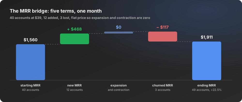
Splitting the terms matters because they move on different clocks and answer to different people. New MRR responds to acquisition work within weeks. Churned MRR responds to onboarding and product work over months. Expansion MRR barely registers for a single-price product and becomes the dominant term for anything seat-based or usage-metered. Collapse all five into one blended growth percentage and you lose the ability to diagnose a miss: acquisition underperforming and retention decaying produce the same disappointing total. Paddle’s reference on monthly recurring revenue sets out the same decomposition, and the discipline it enforces is worth more than any curve-fitting you layer on top.
Build bottom-up, keep top-down as a ceiling check
Bottom-up means starting with a quantity you can count and walking it through rates you have already observed. A worked chain for a self-serve developer tool: 4,000 monthly visits to the docs and landing page, 4% of them starting a signup gives 160 signups, 35% of those reaching a first successful run gives 56 activated accounts, and 12% of activated accounts converting to paid inside 30 days gives 6.7 new customers, or roughly $262 of new MRR at $39.

The chain earns its keep when the forecast misses, because each link can be falsified on its own. You can look at last month and see that traffic came in at plan while activation fell from 35% to 22%, which is an onboarding problem with a name and an owner. A top-down projection, taking a market size and asserting a share of it, gives you nothing to inspect afterwards. Keep top-down for one job only: as a ceiling check. If your bottom-up path implies you will hold several percent of an entire market inside a year, a rate somewhere in the chain is fantasy. Sizing that ceiling honestly is a separate exercise, covered in TAM, SAM and SOM.
One practical note on the rates themselves. Use the rate you measured, not the rate you read in a benchmark post, and when you have no measurement at all, mark the cell as borrowed and write the source next to it. Benchmark conversion rates are drawn from companies with brand recognition, paid budgets and years of SEO you do not have.
Churn deserves a curve, not a constant
A single monthly churn percentage assumes every account carries the same probability of leaving in every month. No real cohort behaves that way. The typical shape is a steep drop in month one, a shallower drop in months two and three, then a flattening as the accounts that found genuine use settle in.
Take an actual early cohort of 20 accounts that signed up in March.
The curve flattens at 50%. Now fit a constant rate to it and watch both directions fail. Fitting the month-one loss of 35% as a flat monthly rate predicts fewer than 4 accounts alive at month four, against the 10 actually paying. Fitting the months-three-to-four loss of zero predicts an immortal customer base and an unbounded lifetime value. The scalar has no way to express the shape.
Two parameters are enough for an early curve: the month-one drop and the level it flattens toward. Forecast each cohort forward on that shape, sum the cohorts, and the retained revenue line becomes something you can defend. Wikipedia’s summary of cohort analysis covers the mechanics of grouping by signup period, and whether your curve flattens at all rather than sliding to zero is among the more reliable signals of product-market fit.
The short-window trap has a signature
EchoSift’s own board shows the trap in miniature, since every pain signal on it carries a growth ratio computed from a recent mention window against the window before it. On the 27 July snapshot, “Invisible Type Errors in CI” shows a growth ratio of 4, its recent mentions having gone from 1 to 5 on a lifetime volume of 15 across 9 distinct owners. “Insecure JWT Secret Handling” shows a growth ratio of 6, from 1 to 7, on a score of 107.5 and a volume of 20. As growth rates those read +400% and +600%. As evidence they are four extra mentions and six extra mentions.
Set them against a third row. “Lack of Regression Detection in Automated Pipeline” shows a growth ratio of 0, because its recent mentions held at 15 against 15 in the prior window, on a lifetime volume of 59. Flat, boring, and by a wide margin the most forecastable of the three, because a series that repeats its level is a series you can project with a stated error bar.
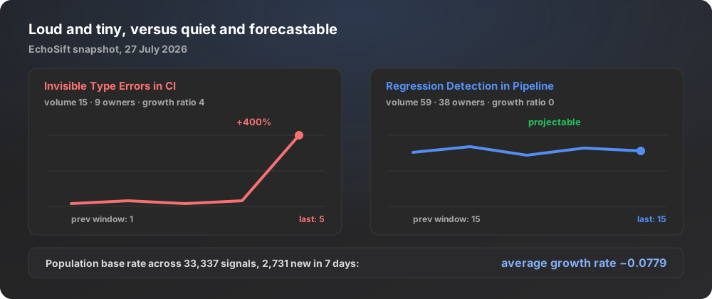
The base rate settles the argument. Across all 33,337 signals in the dataset, with 2,731 of them new in the last seven days, the average growth rate is -0.0779. Slightly negative. Individual rows print +400% and +600% while the population as a whole drifts gently down, which is exactly what a small denominator does to a ratio.
Three rules fall out of this, and they transfer directly to revenue.
First, refuse to let a series with fewer than six observations set a growth rate. Two months of signups gives you two numbers, and two numbers do not make a trend line.
Second, shrink every extreme rate toward the base rate before you use it. If your one good month showed 60% growth and your six-month average is 14%, forecast something between them and closer to the average, weighted by how much data each represents.
Third, state the window on every growth figure you publish, because “+400%” without a stated window cannot be checked by anyone, including you in three months. The NIST/SEMATECH handbook’s introduction to time series analysis frames the general version: the first task with any series is establishing whether it carries trend, seasonality or neither, and four observations cannot answer that question.
Forecasting when you have three months of history
Forecast the inputs you control and derive revenue from them, rather than fitting a curve to an output series that barely exists.
The most useful version is a capacity model. If you can personally run 8 onboarding conversations a week and roughly 1 in 5 turns into a paying account, that produces 6.4 new accounts a month and about $250 of new MRR, independent of anything happening in the wider market. That figure is a floor you can commit to, and it is built from a constraint you can verify with a calendar.
Alongside it, keep an assumption ledger.
Tag every line in the model
One of three tags: measured, with the date and the sample size; borrowed, with the source; or guessed.
Sort the lines by leverage
How much the month-six number moves when that line moves 20%.
Watch the top three
In most early models: the paid conversion rate, the month-one retention drop, and the price.
Price usually carries the largest leverage of the three and is the assumption most often inherited from a competitor’s page rather than tested, which is the whole subject of pricing a developer tool.
The ledger has a second benefit. When someone challenges the forecast, the argument moves from the total to a specific tagged line, which is a much shorter conversation.
Publish a range with a decision attached
A single number implies a precision you do not have. Publish three, and for the chain above month six lands like this.
| Scenario | Where every rate lands | Month-six MRR |
|---|---|---|
| Low | Bottom of its observed spread | $2,900 |
| Base | The middle | $4,100 |
| High | The top | $5,600 |
The range only becomes useful once each branch carries a decision. Write them in advance. If we are tracking the low case by month four, we stop paid acquisition and extend runway. If we are tracking the high case for two consecutive months, we hire the second engineer. Pre-committing removes the temptation to reinterpret a miss as a delay. The statistical form of this idea is the prediction interval, and the founder version is the same claim with consequences bolted on.
Score last month’s forecast before writing this month’s
Keep an error log with three columns: what you forecast, what actually happened, and the absolute percentage error. After four months you will have a median error, and that number tells you how to present the forecast. Under 15% and the base case is worth quoting.
Above 40% median error
The range is your deliverable, and the point estimate comes out of every deck until the error comes down.
Two habits keep the log usable. Freeze the forecast in writing with a date before the month starts, since a projection edited mid-month cannot be scored. And log the reason for each miss against a specific line in the assumption ledger rather than against the total, so that the correction lands where it belongs.
The dataset behind this article spans 4 independent sources and 33,337 clustered signals, and the pattern that shows up in it repeats in every revenue model built too early: the loud, fast-moving rows are the ones with almost no data underneath them, and the quiet flat rows are the ones you can actually plan against. Treat your own revenue series the same way. Forecast the inputs, carry a range, and score yourself monthly until the history is long enough to argue with.
This article was drafted with AI assistance and reviewed against EchoSift’s proprietary signal data before publishing.